Jakob Nielsen's 10 heuristics were created without an emphasis on applications to websites, mobile apps, or other specific interfaces: the original article operates with the broader concept of "system." However, almost all the rules given in it are successfully applied in modern web resources, helping to make them more convenient and intuitive for users.
Heuristics do not have a strict justification, they are useful practical algorithms that make it possible to obtain adequate solutions to problems in most practical cases.
What are that Nielsen's 10 “heuristics” and how to use them?
Jakob Nielsen's 10 general principles for interaction design. They are called "heuristics" because they are broad rules of thumb and not specific usability guidelines.
They are used by usability experts when evaluating and analyzing interfaces, websites or mobile applications. In the process of creating or testing interfaces, their correlation with certain principles and best-known practices is carried out. The method of expert evaluation is very popular, as well as relatively inexpensive and fast compared to comprehensive usability testing.
1. Visibility of system status
The design should always keep users informed about what is going on, through appropriate feedback within a reasonable amount of time.
When users know the current system status, they learn the outcome of their prior interactions and determine the next steps. Predictable interactions create trust in the product as well as the brand.
Tips
- Communicate clearly to users what the system’s state is — no action with consequences to users should be taken without informing them.
- Present feedback to the user as quickly as possible (ideally, immediately).
- Build trust through open and continuous communication.
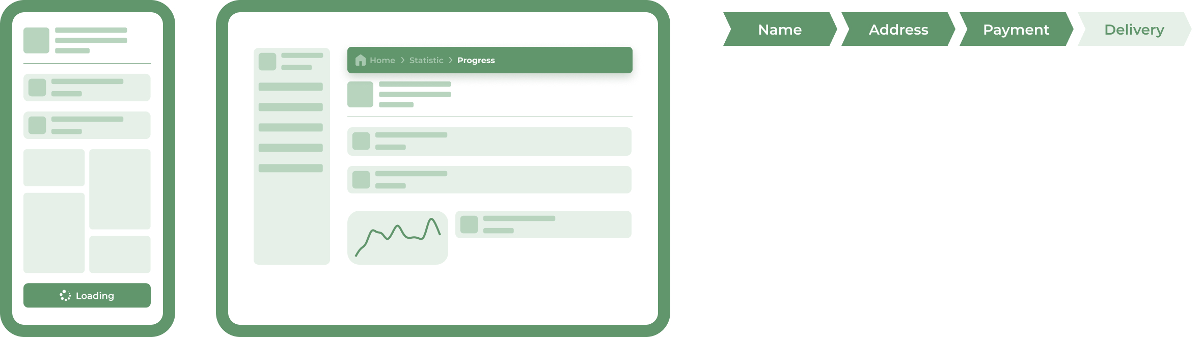
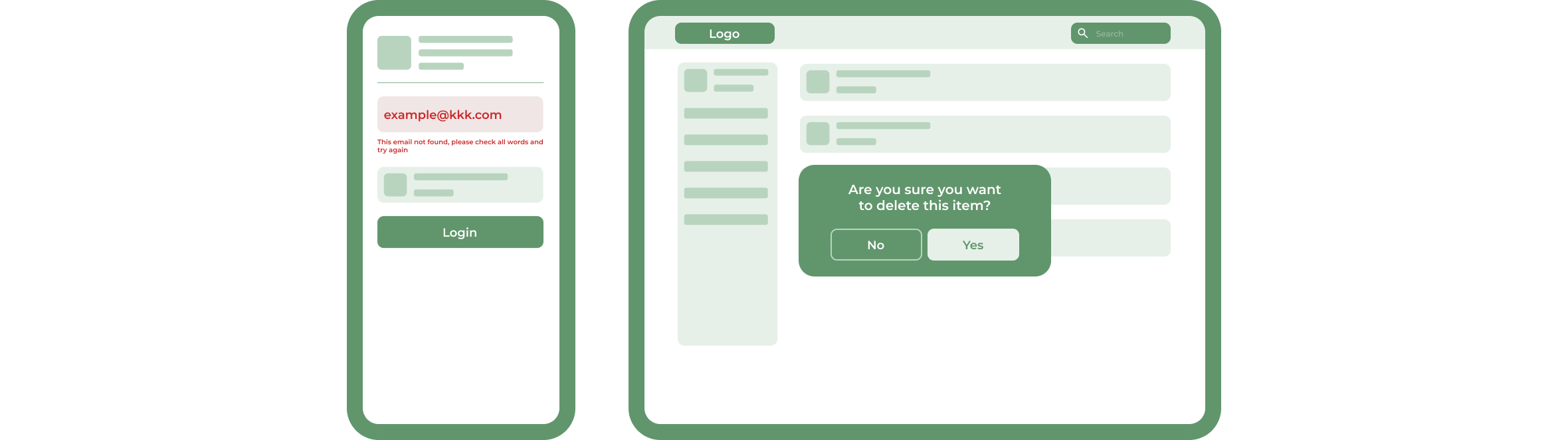
The first of Nielsen's heuristics says that the system should always keep users informed about what is done and simultaneously give feedback within a reasonable time. Because moving around the system, the user asks two questions: where am I and what is happening now? We can answer the first question using breadcrumbs, a secondary navigation system showing a user’s location on a site or web app. Breadcrumbs also provide one-click access to each of the parent directories. When it comes to the second question, a similar mechanism may inform the user that he has placed some items in the basket, but he still needs to choose delivery options and make a payment.
When you download something, a progress bar shows how much time the users need to wait approximately. Moreover, this element communicates that the system is working, which reduces uncertainty. It prevents users from clicking the download button multiple times because they are not sure if it is actually working on the request.
2. Match between the system and the real world
The design should speak the users' language. Use words, phrases, and concepts familiar to the user, rather than internal jargon. Follow real-world conventions, making information appear in a natural and logical order.
The way you should design depends very much on your specific users. Terms, concepts, icons, and images that seem perfectly clear to you and your colleagues may be unfamiliar or confusing to your users.
When a design’s controls follow real-world conventions and correspond to desired outcomes (called natural mapping), it’s easier for users to learn and remember how the interface works. This helps to build an experience that feels intuitive.
Tips
- Ensure that users can understand the meaning without having to look up a word’s definition.
- Never assume your understanding of words or concepts will match your user’s.
- User research will uncover your users' familiar terminology, as well as their mental models around important concepts.
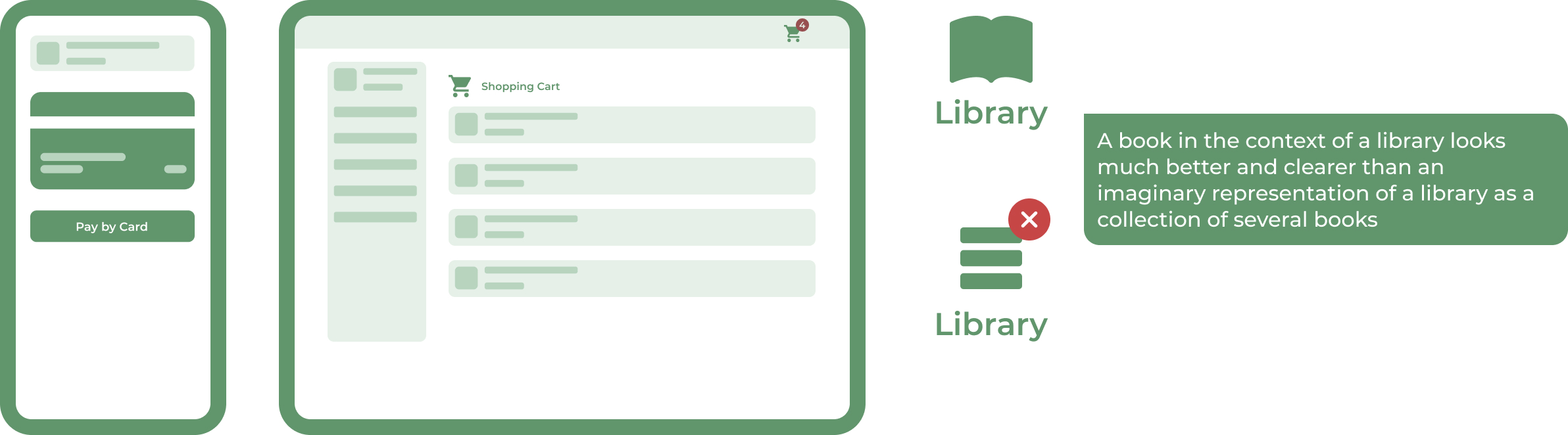
The system should speak the users’ language and avoid incomprehensible system-oriented terms and jargon. If people do not understand the terms used on the site, they will feel foolish and unsure, and also, a lot of them will go elsewhere to find a clearer explanation or even not complete their task. Additionally, more common words are also better for SEO because they are what users search for.
To match the user’s expectations, information should be presented in a natural and logical way that makes sense to the user.
3. User control and freedom
Users often perform actions by mistake. They need a clearly marked "emergency exit" to leave the unwanted action without having to go through an extended process.
When it's easy for people to back out of a process or undo an action, it fosters a sense of freedom and confidence. Exits allow users to remain in control of the system and avoid getting stuck and feeling frustrated.
Tips
- Support Undo and Redo.
- Show a clear way to exit the current interaction, like a Cancel button.
- Make sure the exit is clearly labeled and discoverable.
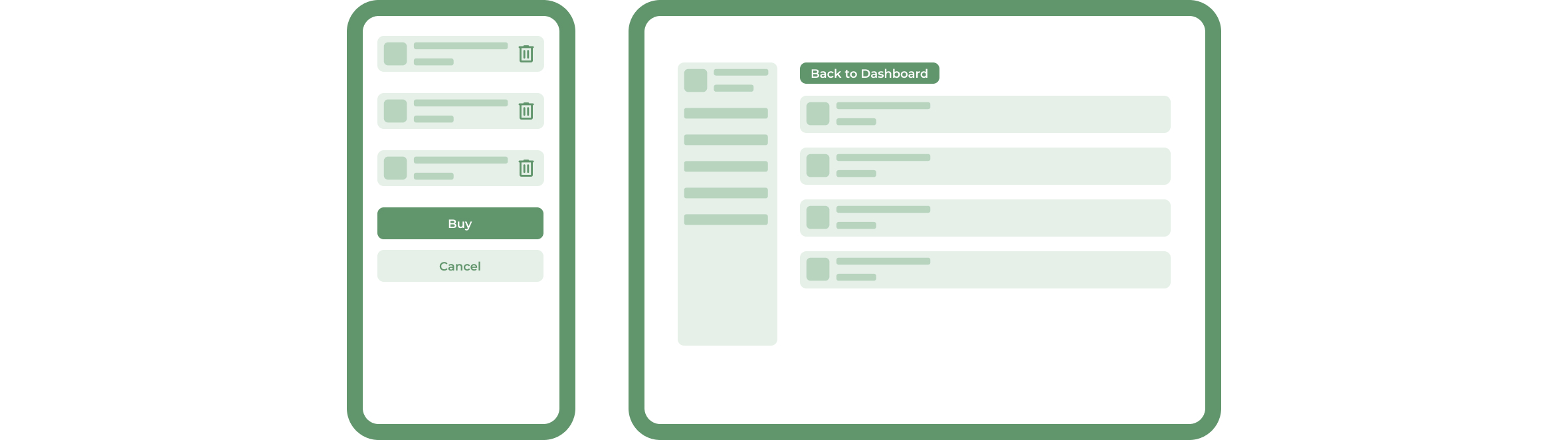
The third principle talks about giving the user freedom to navigate and perform actions - for instance, the freedom to undo or redo any accidental moves. When it comes to online shopping, every user should have control over the operations he performs within the website - like the ability to easily remove a product from the cart with a click.
Nielsen's research shows that around 30% of all internet clicks are back button clicks.
4. Consistency and standards
Users should not have to wonder whether different words, situations, or actions mean the same thing. Follow platform and industry conventions.
Jakob's Law states that people spend most of their time using digital products other than yours. Users’ experiences with those other products set their expectations. Failing to maintain consistency may increase the users' cognitive load by forcing them to learn something new.
Tips
- Improve learnability by maintaining both types of consistency: internal and external.
- Maintain consistency within a single product or a family of products (internal consistency).
- Follow established industry conventions (external consistency).
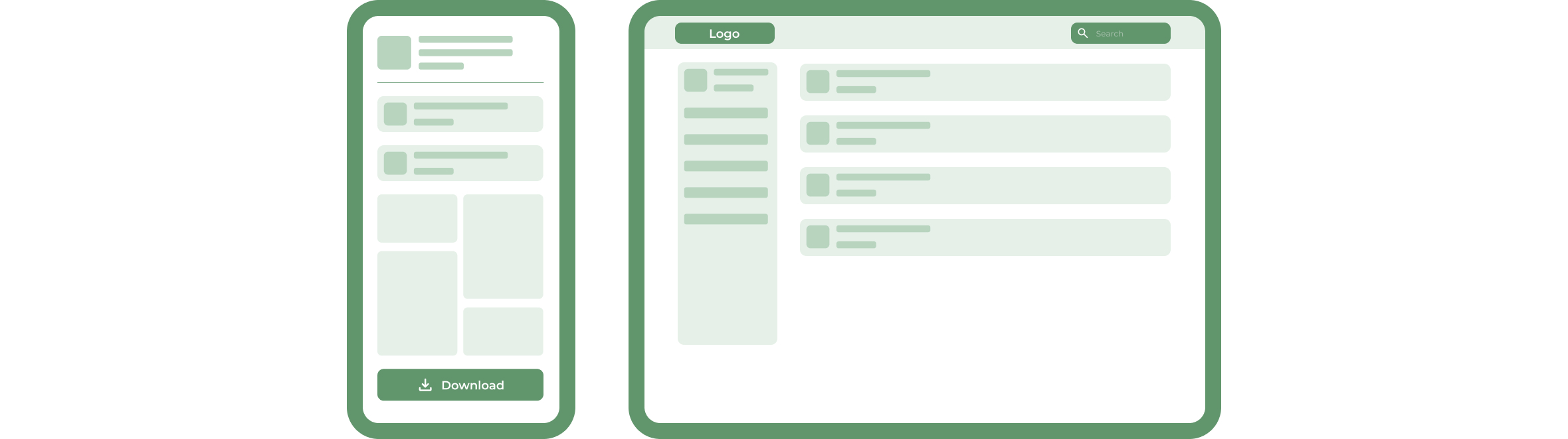
Having so much experience with the interfaces, our brain has created certain patterns, and now we look at specific things at specific places. For instance - the placement of the logo is on the left at the very top and linked to the main page. The search bar is usually on the top right as well as the cart. Remember that consistency is one of the most powerful contributors to usability. Using best practices and common patterns will eventually result in a much better overall experience.
5. Error prevention
Good error messages are important, but the best designs carefully prevent problems from occurring in the first place. Either eliminate error-prone conditions or check for them and present users with a confirmation option before they commit to the action.
There are two types of errors: slips and mistakes. Slips are unconscious errors caused by inattention. Mistakes are conscious errors based on a mismatch between the user’s mental model and the design.
Tips
- Prioritize your effort: Prevent high-cost errors first, then little frustrations.
- Avoid slips by providing helpful constraints and good defaults.
- Prevent mistakes by removing memory burdens, supporting undo, and warning your users.
It is worth mentioning that even better than good error messages is a well-considered design that prevents users from making errors in the first place. In other words, an excellent UX should be like a reliable friend who no matter what warns you before you are about to make a mistake.
Read also: Psychology in Interface Design: 20 Laws of UX
6. Recognition rather than recall
Minimize the user's memory load by making visible elements, actions, and options. The user should not have to remember information from one part of the interface to another. Information required to use the design (e.g. field labels or menu items) should be visible or easily retrievable when needed.
Humans have limited short-term memories. Interfaces that promote recognition reduce the amount of cognitive effort required from users.
Tips
- Let people recognize information in the interface rather than forcing them to remember (“recall”) it.
- Offer help in context instead of giving users a long tutorial to memorize.
- Reduce the information that users have to remember.
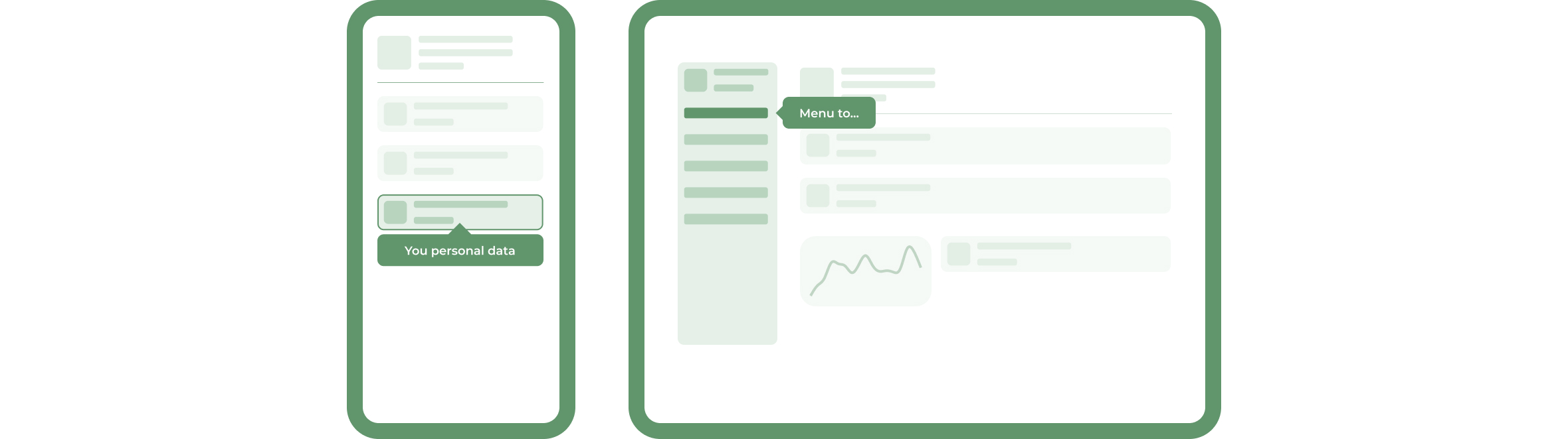
In a nutshell, there are two types of memory retrieval: recognition and recall. The first one happens when you easily recognize a person or an object that you have seen before. We can say that it is a very shallow form of retrieval memory, and it does not require much work. The second one is when you have to find an infrequently used piece of information in your memory. To do it, people need to activate more memory chunks, which means that the recall process is a deeper retrieval and requires more work.
In User Interfaces, you should promote recognition by making information and functions visible and easily accessible. Many mobile apps start with tutorials, but we definitely prefer using tips tailored to the page the user is visiting because tutorials provide too much information that might be unnecessary.
7. Flexibility and efficiency of use
Shortcuts — hidden from novice users — may speed up the interaction for the expert user so that the design can cater to both inexperienced and experienced users. Allow users to tailor frequent actions.
Flexible processes can be carried out in different ways, so that people can pick whichever method works for them.
Tips
- Provide accelerators like keyboard shortcuts and touch gestures.
- Provide personalization by tailoring content and functionality for individual users.
- Allow for customization, so users can make selections about how they want the product to work.
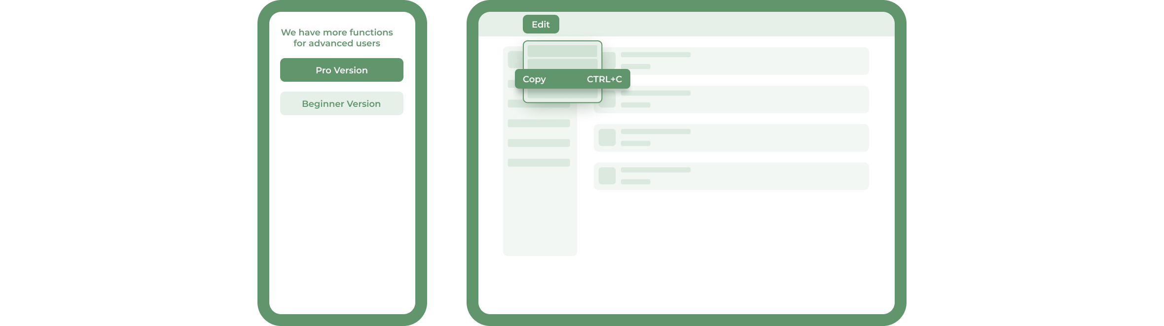
Every system has two types of users - a newbie and an advanced. The interface should be flexible, transforming itself between both of them. For instance, while installing new software, that asks if the user wants to go ahead with default installation or custom installation. An advanced user chooses a custom installation to cut out unnecessary moves.
The efficiency of use means ensuring fast page load time, which significantly impacts the website's conversion rate.
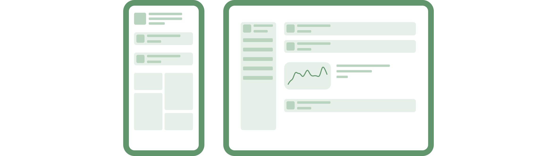
8. Aesthetic and minimalist design
Interfaces should not contain information that is irrelevant or rarely needed. Every extra unit of information in an interface competes with the relevant units of information and diminishes their relative visibility.
This heuristic doesn't mean you have to use a flat design — it's about making sure you're keeping the content and visual design focused on the essentials. Ensure that the visual elements of the interface support the user's primary goals.
Tips
- Keep the content and visual design of UI focused on the essentials.
- Don't let unnecessary elements distract users from the information they really need.
- Prioritize the content and features to support primary goals.
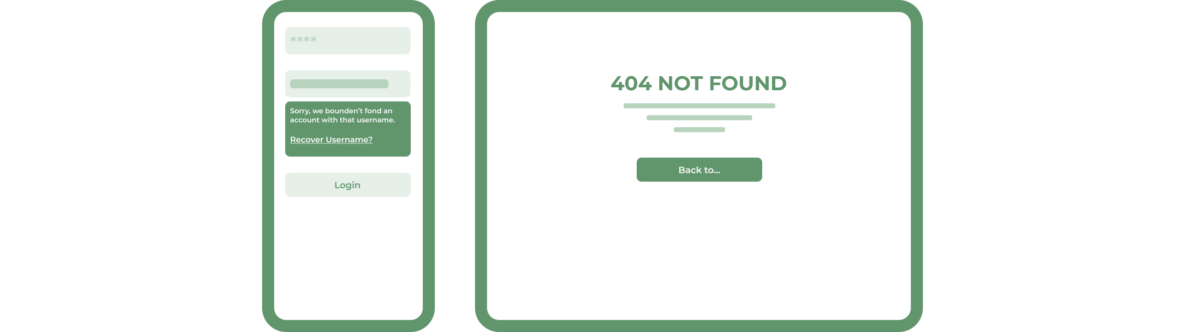
9. Help users recognize, diagnose, and recover from errors
Error messages should be expressed in plain language (no error codes), precisely indicate the problem, and constructively suggest a solution.
These error messages should also be presented with visual treatments that will help users notice and recognize them.
Tips
- Use traditional error-message visuals, like bold, red text.
- Tell users what went wrong in the language they will understand – avoid technical jargon.
- Offer users a solution, like a shortcut, that can solve the error immediately.
10. Help and documentation
It’s best if the system doesn’t need any additional explanation. However, it may be necessary to provide documentation to help users understand how to complete their tasks.
Help and documentation content should be easy to search and focused on the user's task. Keep it concise, and list concrete steps that need to be carried out.
Tips
- Ensure that the help documentation is easy to search.
- Whenever possible, present the documentation in context right when the user requires it.
- List concrete steps to be carried out.
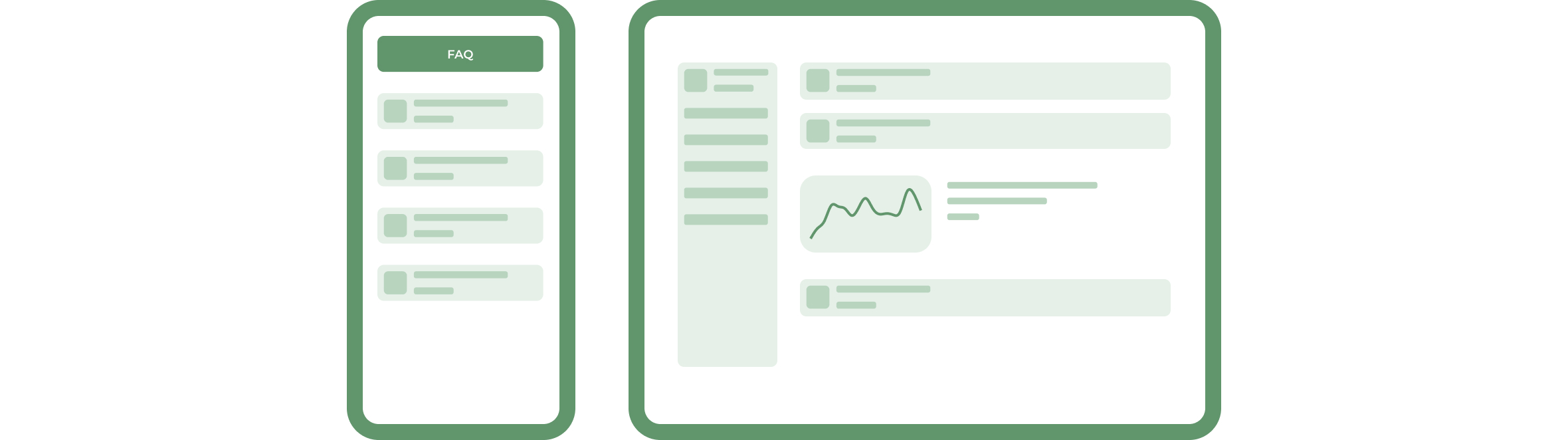
The last of Nielsen's heuristics shows that even if we comply with all previous rules, some users will still need help using the website. At the very bottom of the page, users should find links to relevant help sections - this is a relatively good solution that allows them to quickly and easily find answers to users' bothering questions.
Software Development Hub is a team of like-minded people with broad experience in software development, web and mobile engineering. We provide clients with a full comprehensive custom development cycle, including architecture planning, business analysis for clients, UI/UX design, quality control, project management and support.
Categories
Design
Usability Heuristics